These days when someone mentions apple, most people think of the over priced consumer electronic products. You know the things. The $2,000 Facebook machine or the new flexible iPhone. But believe it or not, there was once a time when the word apple would mean fruit. Yeah, I know, I can’t believe it either. In fact there was actually a prehistoric time when there were no Apple Computers at all! No iPods, iPhones or iMacs. How could civilization have ever possibly survived in a pre iWorld world? Well, it was in this time, between when there was no Apple, and only the apple that people knew of was a fruit, that Apple’s original logo took shape. But it was nothing at all like it is today, and I must say, it was pretty cool.
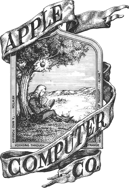
So apple. I bet you thought of an apple that some selfish prick just took a bite out of. The world famous and instantly recognized logo. Well, if you were to get your hands on the first Apple 1 computer this logo is something that you would not find. Why? Apple’s original logo featured a picture of Sir Isaac Newton under an apple tree.
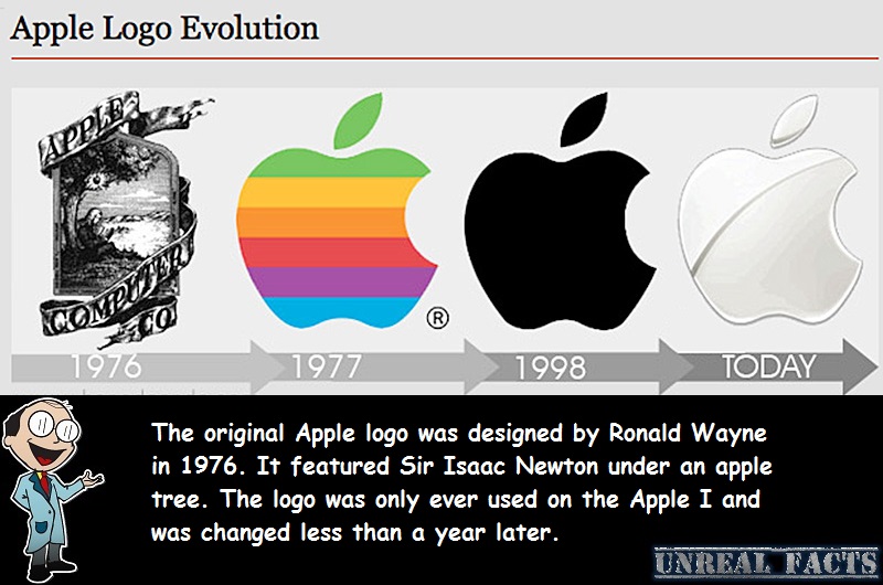
In the early days of Apple Computers inc, back in 1976, it wasn’t the behemoth that it is today. The company was only a small operation started by three friends, Steve Jobs, Steve Wozniak and Ronald Wayne, and it was being run out of Jobs’ garage. As with all companies, big or small, they like to have a logo that can be recognized as being their brand. This is when Ronald Wayne designed the unique branding.
The original Apple logo that Ronald Wayne designed was nothing short of artistic. It wasn’t a simple straight forward logo, it was more a piece of art. The picture was of Sir Isaac Newton pondering below an apple tree. This is a million miles away from what is currently in use now. But just like Wayne, the logo was only a brief addition to the Apple stable.
Not even a year had passed when Steve jobs decided to change the logo. He felt that Wayne’s design was too intellectual and to intricate to be stamped on every Apple computer. Indeed, could you imagine the back of an iPhone with the original one on it? It would have occupied the entire case. The design Jobs settled for was a simple apple with a bite taken out of it, colored with stripes from the spectrum of the rainbow in reverse order. this logo was designed by Rob Janoff.
For twenty years Apple kept this design. It was recognizable, even when Apple itself was nearing failure. In 1997 Jobs felt that the design needed an overhaul, and had the apple worked over again. This time he ditched the colors, and settled on a solid colored, half eaten fruit. The logo we all know today.
SOURCES


